Emanuel Cafè The American bar in the heart of the city
- Industry
- Food & Beverage
- Year
- 2019
- Deliverables
- Brand identity
Illustration
Typography
In Salerno, there is a place to stop and regain possession of your time. It is the Emanuel Cafe, an American bar with an atmosphere that is both convivial and elegant, where excellent raw materials are combined with constant research and knowledge gained directly in the field. Lettera7 has supported Emanuel Cafe in this growth path, designing its entire visual identity through the interpretation of a concept: time.


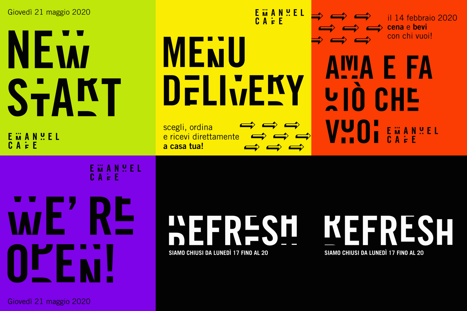
We have developed a typographic language that vaguely refers to Depero and Futurism, designed to change in the different phases of the day. The font designed for the logotype and the various applications is the transposition of a clock, where the rotation of each letter marks the passing of each minute.
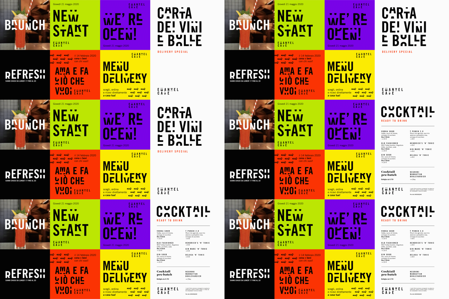
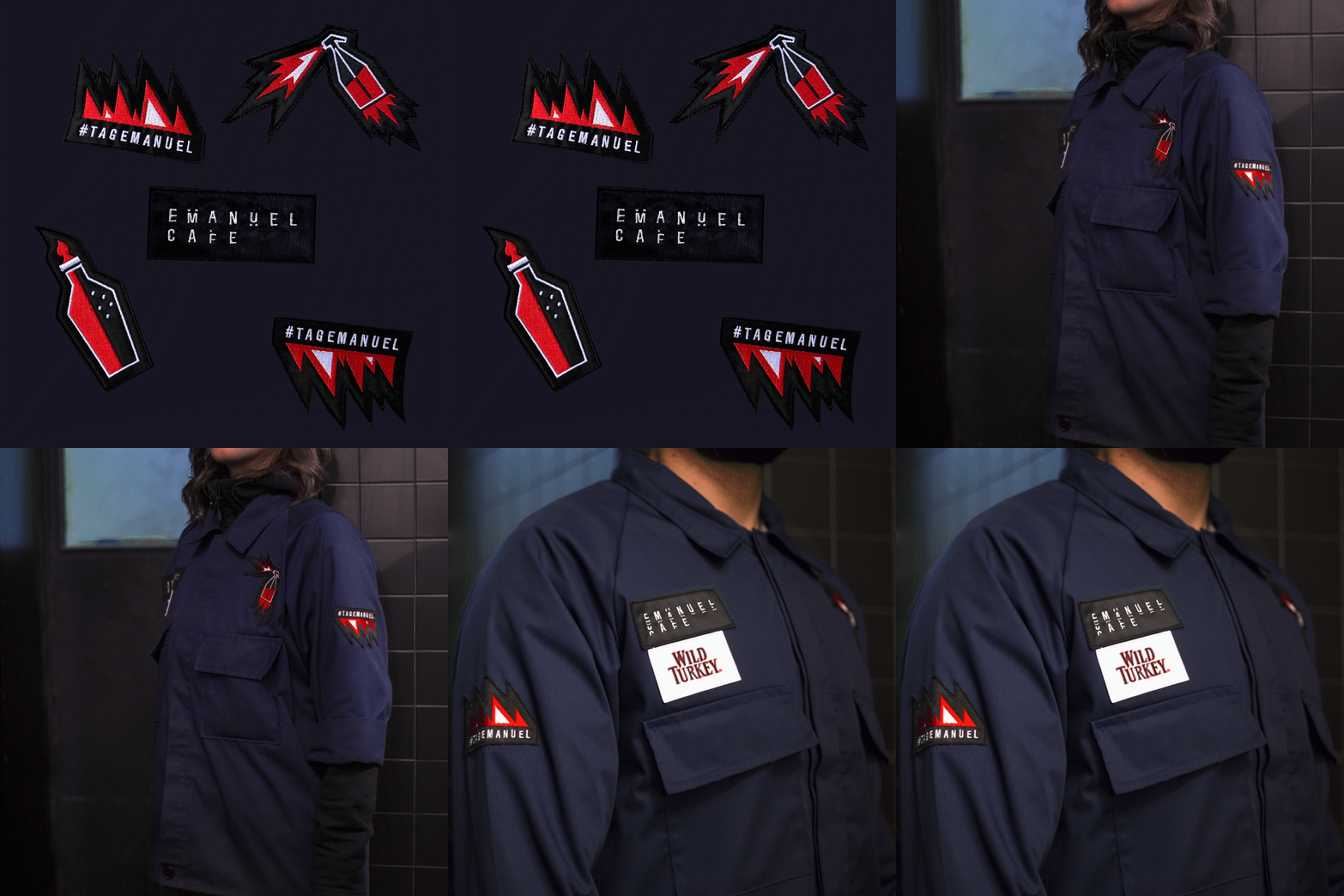
In constant research, on a six-monthly basis, the Emanuel Cafe renews its drink list supported by an incisive layout, which goes beyond the classic menus, and is designed to allow cocktail and wine lists to express the entire offer in a clear and evocative way. as with magazines, along with drink lists, the illustrative style also changes. The uniforms, in working class style, are enriched with patches that mimic military ranks and are the reproduction of the icons used in the various drink lists. The icons increase and the patch collection expands.


