Pasta Armando An authentic and genuine imagery
- Industry
- Food & Beverage
Manufacturing & Industrials - Awards
- One More Pack
- Year
- 2020
- Deliverables
- Digital
Illustration
Packaging
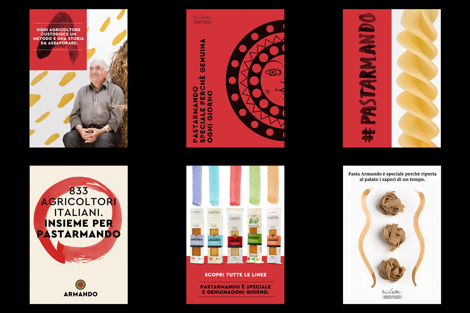
Pasta Armando is a project that brings together the values of a land, the stories of the farmers who cultivate it with dedication and aware and satisfied consumers. The genuineness of this rural world made up of authentic things is reflected in the entire visual universe of the brand, an important tool through which the company stands out on the market, thanks to a unique language that represents the transposition of all its values. The expressive code of Pasta Armando is made up of simple elements that are spontaneously reproduced in all the brand’s applications, allowing the brand to speak to its interlocutors clearly and to offer a breath of fresh air to a highly standardized and homogeneous sector.


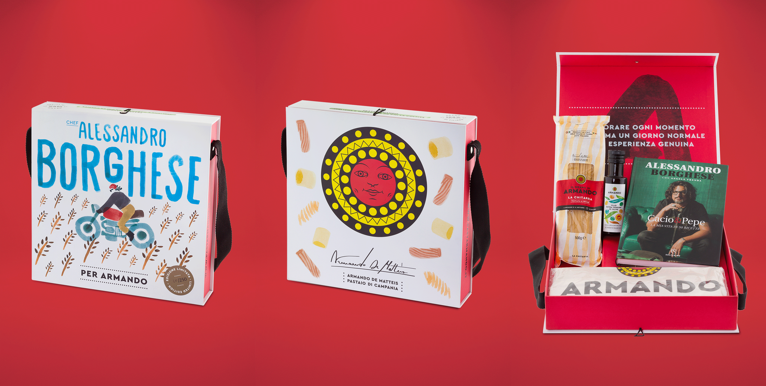
The various special projects feed on this imagery, translating it in a coherent and expressive way, as happens with the Special Edition Box dedicated to the brand ambassador Chef Alessandro Borghese.
A highly artisanal product that welcomes the brand’s gestural typography and offers the consumer a precious package that celebrates 100% Italian wheat and the passion for good food.
The catalogue represents an overview of the project which is given the role of telling the nature of Pasta Armando, enhancing every aspect of the brand and illustrating the variety of lines and products.


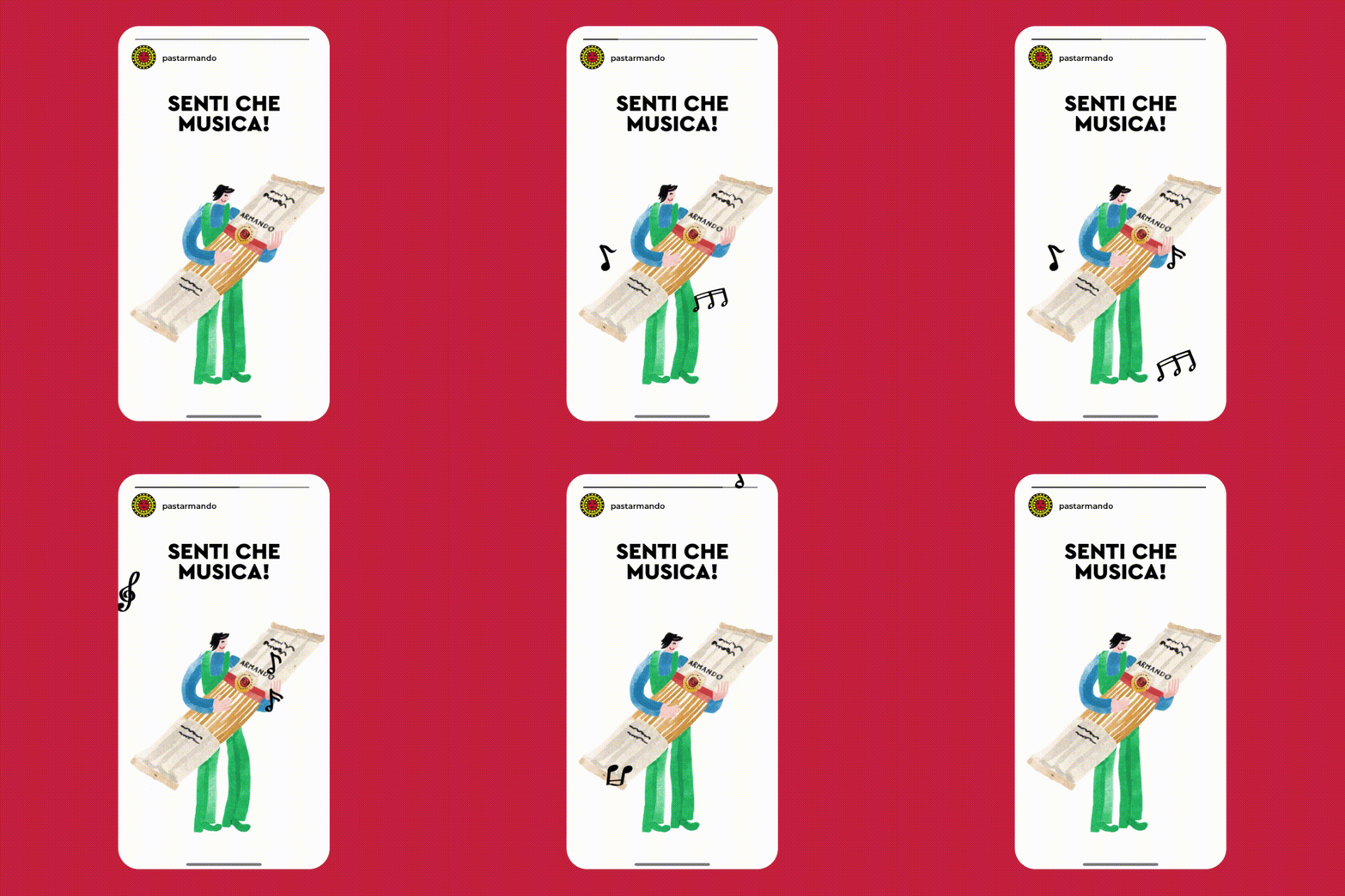
In addition to the consolidated visual codes of Pasta Armando, we have added a new set of watercolors that was created with the aim of expanding and refreshing its language.
The inspiration comes as always from nature and the fields, where wheat is born, the true protagonist of the whole narrative, but ranges between the complex of values and the vision of the brand.
We have carefully selected the themes to be developed and we have represented them through the simplicity and expressive power of the brushstroke that communicates a playful, colorful and genuine world.
All the themes have been developed in three different declinations – watercolor, flat and outline – to meet different printing needs and adapt to multiple applications, thus helping to preserve the visual identity of the brand.


Colour, coherence and spontaneity define this new step in the Pasta Armando project, a brand that expresses its philosophy in every detail and through a visual narrative inspired by an ecosystem made up of spontaneity, lightness and gestures.


The site, tailor-made to integrate the main components of the brand, brings this universe of gestural signs to life outside the pack, presenting every aspect in a functional and complete way. The products are the real protagonists of the e-shop but ample space is also reserved for the history of the brand and the Armando Supply Chain, populated by the engaging stories of farmers.


